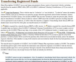
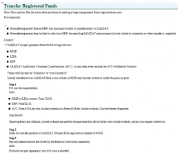
When first making the move to DITA, there are some very important best practices that authors should consider before converting their legacy content.
When doing any sort of conversion from one format to another, the riding principle is always GIGO (garbage in, garbage out). If your legacy content is not particularly good, then converting it to DITA will only create indifferent content in a so-so DITA markup. The result: failure.
So what authoring best practices should you consider before converting your legacy content?
1. Topic-based writing
Your content needs to be able to split nicely into topics. The DITA model uses tasks, concepts, and references, but there are variations like super tasks, glossary, and scenarios that could be useful to keep in mind as well. However, if your content is still in chapter-like narrative form, the resulting conversion will be problematic—and your ability to leverage the advantages of DITA (like re-use) will be negatively affected. Worse still, if you have content that contains a mix of concept, task, and/or reference all in the same “chunk”, then it needs to be re-written.
2. Minimalism
Applying minimalism to content is vital. You could do it post-conversion, of course, but you can save a lot of time by doing it pre-conversion. Minimalism has three important facets to it:
- Write goal-based content: Writing goal-based content means more than just planning your content around tasks (although that, too, is important). It means identifying what your users will be doing with the product and writing those tasks. This is a departure from the feature-based content we often see. It’s the difference between writing the task “Using the Fine Tune feature”, which focuses on the product, and the task “Enhancing your Audio”, which focuses on the user. They might cover similar steps, but the focus of the task is on what the user needs to do, not what the product does. When you start identifying really good user goals, you end up writing about many different features, stringing them together so the user gets the information they need to complete that goal. If you have a lot of tasks that have “if-then” types of choices, you are probably mixing different goals into one task. You can often break those out into separate and more meaningful stand-alone tasks. Once you have your goals written, then it’s time to include the conceptual and reference information to support those goals.
- Provide only the information users need to perform the task inside the task and write nothing extra: This means writing one way to perform a task, not all ways. It means providing troubleshooting information in line with the steps where it can be useful. It means providing step results when they are informative rather than obvious. It also means not documenting the “cancel” button.
- Get rid of the chaff: This includes those rather unnecessary lead-in sentences like “This chapter introduces you to …” or “this table contains information about…”. When your topic and table titles are clear and your content is well written, you can completely remove those extra words (that users, ahem, skip over anyhow).
3. Navigation
Authors are frequently in love with cross references, especially inline cross references (example: “For more information about x, see link”). Users, however, are not so in love with them. One user recently referred to it as “falling into a spinning circle”. By the time they have followed the link from the original topic (which led them to a web of five more topics), they not only can’t find their way back to the original task, they can’t even remember what the original task was. I call it “the spaghetti mess of links”.
Links between topics should be kept to an absolute minimum and should only be inline in rare circumstances. If you need to link two topics together, the best place for that is at the side or at the bottom of the topic and often DITA will do that automatically for you. What are valid reasons for linking topics? When the user will never be able to guess that those two topics are related, or that the two topics are not “siblings” to each other in the hierarchy of content, or when you want to introduce a sequence between topics.
There are other valid reasons to include links, but the goal here is to keep linking to a minimum so that users will find the links useful. As a result, they will also pay more attention to links when you provide them. Another goal is to minimize dependencies between topics. You should be putting all links in relationship tables, which are linking mechanisms that live in the DITA maps instead of inside the topics. By removing the links from inside the topics and putting them at a higher level, inside the map, you leave the topics dependency-free to be re-used wherever necessary.
4. Structural monstrosities
Let’s face it: we sometimes do odd things to our content in order to organize it as best we can. The result is sometimes something too complex to convert well to DITA. One example is a table within a table. Another monstrosity is having procedures in tables for some understandable formatting and layout advantages. Clean up your monstrosities and make them pretty enough to go to the Ball. DITA will give you other ways to organize your content without that sort of complexity.
Links between topics should be kept to an absolute minimum and should only be inline in rare circumstances. If you need to link two topics together, the best place for that is at the side or at the bottom of the topic and often DITA will do that automatically for you. What are valid reasons for linking topics? When the user will never be able to guess that those two topics are related, or that the two topics are not “siblings” to each other in the hierarchy of content, or when you want to introduce a sequence between topics.
There are other valid reasons to include links, but the goal here is to keep linking to a minimum so that users will find the links useful. As a result, they will also pay more attention to links when you provide them. Another goal is to minimize dependencies between topics. You should be putting all links in relationship tables, which are linking mechanisms that live in the DITA maps instead of inside the topics. By removing the links from inside the topics and putting them at a higher level, inside the map, you leave the topics dependency-free to be re-used wherever necessary.
5. Structure without differentiating meaning
I have yet to see legacy content that doesn’t include formatting for something like bold, italics, or underline. They are each often applied for very different reasons though. For example, you might italicize a phrase to indicate that it’s a book name, or because it’s a first occurring term, or for emphasis.
In DITA, if you apply the <i> element to all of these different types of content, then you won’t be able to leverage the markup properly. The <cite> element is used to indicate a book or external reference name. A term might be put in the <term> element. Emphasis, on the other hand, is simply not an acceptable reason to change font weight anymore. Once you are using the right elements for the right sort of emphasis, you’ll be able to leverage the formatting for those items separately and do cool things like link your <term> elements to actual glossary descriptions so users have inline rollovers with definitions.
So get familiar with your DITA inline elements like <uicontrol>, <menucascade>, <cite>, <term>, <ph>, <dl>, and get them to work for you.
A good conversion method will be smart enough to make those distinctions for you or help you make them, but that’s a key piece of conversion functionality you should look out for.
6. Short descriptions
If you haven’t yet encountered the DITA short description, count yourself lucky. It is the only element that legacy content often doesn’t have. DITA best practices say that each topic (every one!) should have a short description. If you’re thinking, “Big deal, I’ll just put my first sentence as the short description everywhere”, then let me stop you right there. A short description is the single hardest piece of content to write in the DITA model.
A good short description is succinct (less than two lines for sure, better to make it one). It accurately describes the topic without repeating the title, and gives users just the right information that, when they see the title+short description combination, allows them to decide whether that topic is worth navigating to or not.
In all online outputs, the title+short description is visible every time your content is in a hierarchy (parent-child). That’s why it looks odd when some topics have short descriptions and others don’t. You should either use them everywhere or use them nowhere.
The short description is a powerful interpretive tool that lets you bridge what is often required technical jargon in the title with the terms a user might be more familiar with. It often leads to the “Oh, that’s what you mean” moment for users. Wield it wisely.
Good Results and Bad Results
The first example is an “as is” conversion.

This second example is the same content, but with ‘best practices’ applied.
